Punch your users in their eyes with this Neubrutalist Design System
What is Neubrutalism?
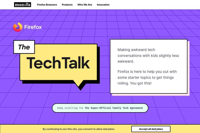
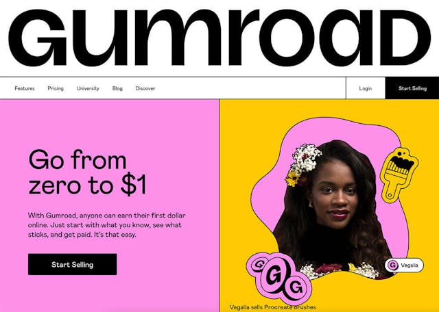
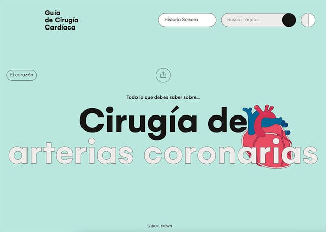
Neubrutalist web design often features elements such as bold typography, minimalistic layouts, rough or unpolished aesthetics, and a focus on functionality over ornamental details. It embraces a certain level of imperfection and simplicity, challenging traditional design conventions and favoring a more straightforward and stripped-down approach.

Traits
Ugly(ish)
Neubrutalism often embraces an intentionally "ugly" or unpolished aesthetic. It challenges conventional notions of beauty and deliberately incorporates elements that might be considered visually unappealing or jarring by traditional design standards.
Look at me!
do not hesitate trying new things!
Clashing colors
Neubrutalist designs can evoke a sense of dynamism, energy, and even discomfort. It disrupts expectations and draws attention to the visual impact of contrasting hues.
No gradients
Neubrutalism reinforces its emphasis on minimalism and straightforwardness. This approach aligns with the overall objective of challenging traditional design norms and rejecting excessive embellishments or decorative elements.
NeuBrutalism examples
Approach of this project
This project will be a web app where you can preview the components and copy the HTML/JSX code with TailwindCSS classes, instead of installing a npm library.
More details in the future.
I want to use it!
Subscribe to the newsletter to get the latest updates about this new and Neubrutal design system!

